
The world of stock trading is dynamic and complex, filled with endless opportunities and challenges. To navigate this intricate maze successfully, every trader needs a solid understanding of technical analysis – the key to unlocking profitable trading strategies. In this comprehensive guide, we will delve into the three golden rules of technical analysis and empower you with the knowledge needed to make informed trading decisions in the US stock market.
1. Follow the Trend: Your Pathway to Profitability
Imagine the stock market as a vast ocean, with waves of price movements ebbing and flowing. Just as a sailor navigates the seas, traders must learn to ride the market waves. The first golden rule is simple yet fundamental: follow the trend. Whether it’s an upward trend (bullish) or a downward trend (bearish), aligning yourself with the market’s direction significantly increases your chances of success.
Upward trend (bullish trend)
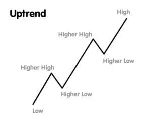
In technical analysis, an upward trend occurs when the price of a stock or an asset consistently moves in an upward direction over a period of time. This pattern is characterized by higher highs and higher lows on a price chart. Investors and traders use various technical indicators and chart patterns to identify and confirm these trends. An upward trend signifies increasing market confidence, optimism, and a strong demand for the stock, leading to rising prices.
Imagine the stock market as a staircase, and each step represents the price of a stock. An upward trend is like climbing a staircase where you are continually moving upward. Here’s how this analogy helps explain an upward trend in a friendly way:
- Initial Step (Low Price): You start at the bottom of the staircase, representing a low stock price. At this point, investors might be hesitant, and the stock is undervalued.
- Climbing Up (Higher Lows): As you take steps, you move upward. Each step you take represents a higher low in the stock price. This means that even during minor pullbacks, the price doesn’t drop as low as the previous low. Investors are becoming more confident, and there is a consistent demand for the stock.
- Reaching a Landing (Resistance Level): After climbing several steps, you reach a landing, which represents a resistance level in technical analysis. This is a price point where the stock faces some selling pressure. Imagine there’s a landing on the staircase, and people tend to pause there.
- Breaking Through (Breakout): With determination, you manage to break through the landing and continue climbing. In the stock market, this breakout represents the stock price overcoming the resistance level. It indicates a strong buying interest and a potential for further price increase.
- Climbing Higher (Higher Highs): As you keep climbing, each step you take is higher than the previous one. This mirrors the concept of higher highs in technical analysis. The stock price continues to rise, reaching new peaks.
- Reaching the Top (Peak Price): Finally, you reach the top of the staircase, which symbolizes the peak price of the stock during the upward trend. This is the highest point the stock has reached, and investors are very optimistic about its future performance.
In this friendly analogy, climbing a staircase illustrates the gradual and positive movement of stock prices during an upward trend. Just as climbing stairs requires consistent effort, an upward trend reflects the market’s sustained optimism and investor confidence, leading to rising stock prices.
Technical Indicators for Upward Trend:
In the stock market, traders use technical indicators like moving averages and Relative Strength Index (RSI) to confirm upward trends. For instance, a moving average is a commonly used indicator that smooths out price data to identify trends over a specified time period. If the stock price is consistently above its moving average and the moving average itself is sloping upwards, it confirms the presence of an upward trend.
Understanding and recognizing upward trends through technical analysis can help traders and investors make informed decisions, indicating a potentially profitable time to buy or hold onto their investments.
Downward trend (bearish trend)
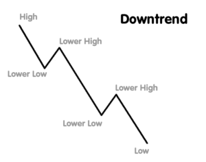
In technical analysis, a downward trend refers to a consistent pattern where the overall direction of a stock’s price is decreasing over a period of time. This pattern is identified by a series of lower highs and lower lows on a price chart. Investors and traders use various technical indicators and chart patterns to recognize and confirm these trends. Downward trends are often associated with pessimism and a lack of investor confidence in the market or a particular stock.
Imagine you are sailing a boat in the ocean. The water level represents the stock price, and your journey represents the stock market trends. In a downward trend, it’s like your boat is gradually sinking due to a storm. Here’s how this scenario plays out:
- Initial Confidence (High Tide – Peak Price): At the beginning of your journey, the boat (stock price) is at a high level, indicating a peak price. You are confident and optimistic about your sailing adventure.
- Encountering the Storm (Lower Highs): As the storm hits, the water level starts dropping, representing the stock price decreasing from its peak. During a downward trend, each wave (price movement) is lower than the previous one. These lower highs signify that after every market rally, the stock price fails to reach the previous high point, indicating a weakening market sentiment.
- Navigating Troubled Waters (Lower Lows): With each wave, the water level also goes lower than before, symbolizing the stock price dropping to new lows. These lower lows confirm the downward trend, showing that the stock price is consistently decreasing over time.
- Challenges and Caution (Investor Sentiment): As your boat struggles in the storm, you become cautious and concerned about your safety. Similarly, during a downward trend, investors and traders become wary and hesitant. They might sell their stocks to prevent further losses, leading to a self-fulfilling prophecy where selling pressure continues the downward trend.
- Strategic Decision-making (Investment Strategies): Just as you might decide to anchor your boat in a safe spot to wait out the storm, investors might choose to diversify their portfolios, invest in safer assets, or even sell their stocks short to profit from the falling prices during a downward trend.
- Waiting for Clear Skies (Recovery): Eventually, the storm subsides, and the water level stabilizes. In the stock market, this stabilization might indicate the end of the downward trend. Investors carefully watch for signs of market recovery, such as higher highs and higher lows, before regaining confidence and making new investment decisions.
Understanding downward trends using relatable scenarios like navigating a stormy sea can help simplify complex financial concepts and make them more accessible to everyone.
Sideways trend (horizontal or ranging trend)
In technical analysis, a sideways trend occurs when the price of a stock or an asset remains relatively stable and moves within a horizontal range for an extended period. During a sideways trend, the stock price fluctuates within a certain price range, creating a pattern of roughly equal highs and lows. This trend signifies a balance between buyers and sellers, indicating indecision or a lack of significant market momentum in either direction.
Imagine you are driving on a highway. The speed of your car represents the stock price, and the highway represents the price range within which the stock is trading. Here’s how a sideways trend can be likened to a traffic jam scenario:
- Steady Pace (Initial Stability): As you start driving, the traffic moves at a steady pace, symbolizing a stable stock price. There is no clear acceleration or deceleration in the movement of vehicles, indicating a lack of strong buying or selling pressure in the stock market.
- Traffic Congestion (Sideways Movement): Gradually, you encounter a stretch of the highway where several vehicles are moving at a similar speed, but there’s congestion. Some cars speed up a bit, while others slow down, creating a range of speeds within a limited space. Similarly, in a sideways trend, the stock price moves within a specific price range, with minor fluctuations but without a clear upward or downward trend.
- Limited Progress (Equal Highs and Lows): As you look around, you notice that the cars ahead of you and behind you are at almost the same position, indicating equal highs and lows in the traffic. Similarly, in a sideways trend, the stock price reaches similar high points (resistance levels) and low points (support levels) without making significant progress in either direction.
- Stuck in the Jam (Indecision): Just like drivers might feel frustrated or uncertain during a traffic jam, investors may feel indecisive during a sideways trend. It’s challenging to predict the next price movement because there isn’t a dominant force (buyers or sellers) driving the market in a particular direction.
- Patience and Observation (Investor Strategy): During a traffic jam, experienced drivers might choose to wait patiently, change lanes, or find an alternative route. Similarly, investors in a sideways market might adopt a wait-and-see approach, looking for clearer signals or news that could potentially break the market out of its indecisive phase.
- Clearing the Road (Breakout): Eventually, the traffic jam clears, and cars start moving at a regular pace again. In the stock market, a breakout occurs when the price finally moves decisively above or below the sideways range. This breakout often leads to a new trend, either upward or downward, indicating a shift in market sentiment and prompting investors to adjust their strategies accordingly.
Understanding a sideways trend as a traffic jam scenario can make this concept relatable and help people grasp the idea of stagnant price movements and market indecision in a more friendly and accessible way.
Tools to Identify Trends
Moving Averages
Moving average is a widely used concept in stock market technical analysis. It smoothens out price data to identify trends over a specific period of time. It is called a “moving” average because it continuously calculates an average of the most recent prices, dropping the oldest data point as new data becomes available.
Elaborating Moving Average:
- Types of Moving Averages:
- Simple Moving Average (SMA): It calculates the average price over a specific number of periods equally.
- Exponential Moving Average (EMA): It gives more weight to recent prices, reacting more quickly to price changes.
- Purpose:
- Trend Identification: Moving averages help traders identify the direction of the trend, whether it’s upward (bullish) or downward (bearish).
- Support and Resistance: Moving averages often act as support in uptrends and resistance in downtrends.
- Crossovers: When short-term moving average crosses above long-term moving average, it generates a buy signal (golden cross). Conversely, when short-term moving average crosses below long-term moving average, it’s a sell signal (death cross).
Trendlines
Trendlines are fundamental tools in stock market technical analysis. They are lines drawn on a price chart to represent the direction and intensity of a price trend. Trendlines help traders and investors identify trends and potential reversal points. Let’s break it down using a practical example from everyday life:
Elaborating Trendlines:
- Drawing Trendlines:
- Uptrend Line: Connects higher lows, indicating an upward price trend.
- Downtrend Line: Connects lower highs, indicating a downward price trend.
- Horizontal Trendline: Represents a price level where the stock has a historical tendency to bounce off.
- Purpose:
- Trend Confirmation: When a stock price consistently follows an uptrend or downtrend line, it confirms the existing trend.
- Reversal Signals: If a stock’s price crosses above a downtrend line or below an uptrend line, it may signal a trend reversal.
- Support and Resistance: Trendlines often act as support in uptrends and resistance in downtrends.
Chart Patterns
Chart patterns are essential tools in stock market technical analysis. They are formations created by the price movements of stocks, currencies, or other financial instruments on a chart. Analysts use these patterns to predict future price movements based on historical behavior. Let’s explore this concept with a practical example from everyday life:
Elaborating Chart Patterns:
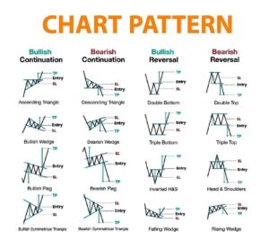
- Types of Chart Patterns:
- Head and Shoulders: Indicates a potential reversal of an uptrend.
- Double Top and Double Bottom: Signals a trend reversal after reaching a peak or trough.
- Triangles (Ascending, Descending, Symmetrical): Represents periods of consolidation before the price continues its trend.
- Flags and Pennants: Short-term continuation patterns within a strong trend.
- Purpose:
- Pattern Recognition: Analysts identify specific shapes on charts that historically lead to predictable price movements.
- Predicting Price Movements: Patterns often indicate whether a stock’s price is likely to go up, down, or consolidate.
- Entry and Exit Points: Traders use these patterns to determine when to enter or exit a trade.
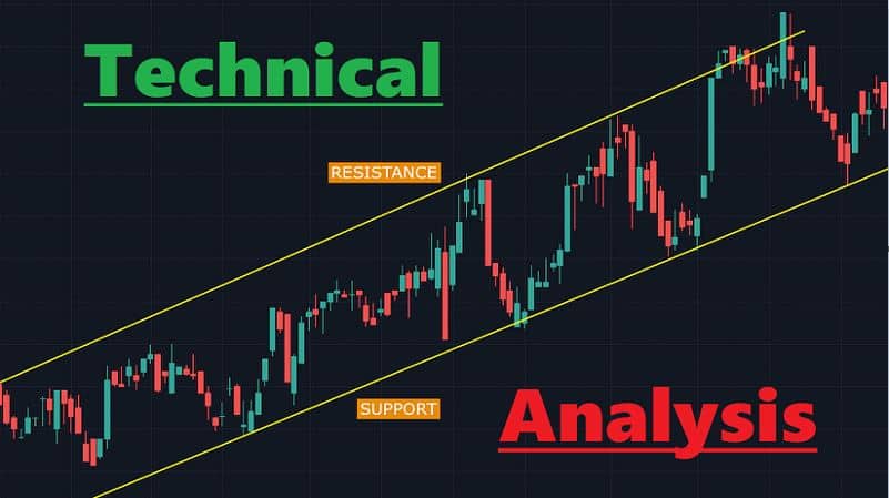
2. Mastering Support and Resistance Levels
Support and resistance levels are the bedrock of technical analysis. Think of support as a safety net preventing prices from falling further, and resistance as a barrier preventing prices from rising. Recognizing and understanding these levels is crucial for making strategic trading decisions.
Key Points:
Support
Support refers to a price level at which a stock or market index tends to stop falling and may even bounce back. It is essentially a level where buying interest is significantly strong enough to overcome selling pressure. Traders and investors use support levels to make decisions about buying or selling stocks.
How to Identify Support Levels:
1. Historical Price Data:
- Chart Analysis: By looking at historical price charts, traders identify specific price points where a stock has historically had a hard time falling below. These points indicate potential support levels.
- Moving Averages: Moving averages, especially long-term ones, can act as dynamic support levels. When the price approaches a moving average and bounces off it, it’s considered a support level.
2. Volume Analysis:
- Volume Spikes: A surge in trading volume at a particular price level indicates increased buying interest. Such spikes often coincide with support levels.
3. Fundamental Analysis:
- Earnings Reports: Positive earnings reports or other fundamental news can create strong support levels. Investors might consider a stock to be a good buy at such levels.
4. Psychological Levels:
- Round Numbers: Prices ending with multiple zeros (like $100) often act as psychological support levels. Many traders place buy orders just above these levels.
Practical Example:
Imagine you are running a lemonade stand. Your lemonade sells well at $2 per cup, but if you raise the price to $3, fewer people are willing to buy. You notice that whenever you price it at $2, you sell out quickly, indicating strong demand – your support level. However, at $3, the demand is much weaker, and you often have leftover lemonade, indicating a lack of support at this price level.
One day, you decide to analyze your sales data. You find that every time there’s a heatwave (positive news), people are more willing to pay $3 for a cup of lemonade, creating a new support level at this higher price.
Additionally, you notice that on weekends (high trading volumes), even if the temperature is average, more people are willing to buy at $3, suggesting a different kind of support level related to increased demand during specific times.
So, just like in the stock market, where certain price levels (support) attract buying interest, your lemonade stand experiences higher demand at specific price points, helping you set the right price to maximize your sales. Understanding these support levels (prices where people are willing to buy) is crucial for both your lemonade stand and stock market traders to make informed decisions.
Resistance
Resistance refers to a price level at which a stock or market index faces selling pressure, preventing it from rising further. Resistance levels are significant because they represent points where the supply of a stock (from people looking to sell) is more significant than the demand (from people looking to buy), causing the price to stall or reverse.
How to Identify Resistance Levels:
1. Historical Price Data:
- Chart Patterns: Traders often look for patterns like double tops or triple tops, where the price reaches a certain level multiple times but fails to break through. These levels indicate strong resistance.
- Previous Highs: Previous peaks in a stock’s price can act as resistance because investors who bought at those levels may be looking to sell when the price approaches those points again.
2. Volume Analysis:
- Volume Peaks: Similar to support, spikes in trading volume near specific price levels can indicate strong resistance. High volume suggests a lot of selling activity at that price.
3. Trendlines:
- Downtrend Lines: In a downtrending market, a line drawn connecting the lower highs can act as a resistance line. If the price approaches this line, it often faces resistance.
4. Psychological Levels:
- Round Numbers: Just like with support, prices ending with zeros (like $100) often act as psychological resistance levels. Traders might place sell orders just below these levels.
Practical Example:Imagine you are trying to inflate a balloon, but no matter how hard you blow into it, it doesn’t expand beyond a certain size. This limitation occurs because the rubber of the balloon (similar to the stock price) faces resistance from the air pressure inside (representing buying pressure) and the tension of the rubber (symbolizing selling pressure).
Initially, as you start blowing, the balloon easily expands. However, as it gets larger, the rubber becomes tighter, resisting the expansion. You have reached a point where the force you apply (analogous to market demand) is equal to the resistance of the balloon’s rubber (comparable to market supply).
In this analogy, if you imagine the balloon expanding to a certain size but not bursting, it’s akin to a stock price reaching a resistance level. No matter how much buying pressure (your blowing) is exerted, there’s an equal force of selling pressure (the tension in the rubber) preventing the stock price (or balloon) from going higher.
Understanding these resistance levels is crucial for traders. If, metaphorically speaking, the rubber of the balloon becomes stronger (indicating stronger selling pressure), it might withstand more blowing (buying pressure) before popping (stock price reversal). Traders use these principles to make decisions about when to sell stocks, anticipating that prices might struggle to rise beyond these resistance levels.
3. Confirmation Through Volume Analysis
Listening to the Market’s Roar
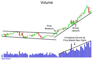
Volume analysis is akin to listening to the crowd’s reaction in a concert – it tells you the intensity of market sentiment. Volume confirms the strength of price movements, providing traders with valuable insights into market conviction.
Volume Indicators:
Volume Bars
volume bars represent the number of shares or contracts traded in a particular security or market during a given period of time. These bars are often displayed at the bottom of price charts and provide crucial information about market activity. Volume bars help traders and analysts understand the strength and sustainability of a price trend, identify potential reversals, and confirm the validity of price movements.
How to Interpret Volume Bars:
- High Volume and Price Movements:
- Increasing Volume with Price Uptrend: When prices are rising, and the volume is increasing, it indicates strong buying interest, confirming the uptrend’s strength.
- Increasing Volume with Price Downtrend: Conversely, in a downtrend, rising volume suggests strong selling interest, confirming the downtrend’s strength.
- Reversal Signals:
- Volume Spikes at Reversal Points: A sudden spike in volume at a potential reversal point can indicate a significant shift in market sentiment. For example, a sharp increase in volume after a prolonged downtrend might signal a potential trend reversal to the upside.
- Confirmation of Price Patterns:
- Breakout Confirmation: In chart patterns like breakouts (where a stock price moves beyond a certain level), high volume often confirms the validity of the breakout. If a stock breaks out on high volume, it suggests strong conviction among traders.
Practical Example:
Imagine you’re organizing a garage sale. The volume of your sale can be compared to the volume bars in stock market analysis. Here’s how:
- Customer Traffic (Volume):
- If there are many people coming to your garage sale, it indicates high volume. More visitors mean higher interest in the items you’re selling, similar to high trading volume in the stock market indicating strong interest in a particular stock.
- Sales and Price Movements:
- High Volume with High Sales: Suppose you notice that on the days with the most visitors (high volume), you also make the most sales. This indicates that there’s a direct correlation between the number of visitors (volume) and the money you make (price movements).
- Low Volume with Low Sales: Conversely, on days when very few people show up (low volume), your sales are also low. This mirrors the concept in the stock market where low volume often accompanies periods of price consolidation or indecision among traders.
- Sudden Rush of Buyers (Volume Spikes):
- Imagine there’s a sudden rush of people to your garage sale, and they start buying items in large quantities. This surge in buying interest is akin to a volume spike in the stock market. It indicates a sudden increase in trading activity, often suggesting an important event or news that has attracted traders’ attention.
Understanding volume bars is like gauging the foot traffic at your garage sale. Just as a crowded sale attracts more potential buyers, high trading volume attracts more traders, indicating increased interest and often signaling significant price movements in the stock market.
Volume Weighted Average Price (VWAP)
The Volume Weighted Average Price (VWAP) is a trading benchmark that gives the average price a security has traded at throughout the day, based on both volume and price. Unlike a simple average price, VWAP gives more weight to prices with higher trading volume. Traders use VWAP to assess the average price investors have paid for a stock and to determine the general trend of the market for that day.
How to Calculate VWAP:
- For Each Trade:
- Multiply the price of the trade by the number of shares traded at that price.
- For example, if 100 shares were traded at $50, the calculation would be: 100 shares×$50=$5000
- Total the Values:
- Sum up all these calculated values for every trade that occurred during the day.
- Total Volume:
- Add up the total volume of shares traded throughout the day.
- VWAP Calculation:
- Divide the total value from step 2 by the total volume from step 3 to get the VWAP.
Practical Example:
Let’s consider a practical scenario to understand VWAP better: buying groceries at a supermarket.
Imagine you have a shopping list with various items, and each item has a different price. The quantity you buy of each item represents the volume of trades, and the price of each item represents the price at which the trade occurs.
- Calculating VWAP:
- For instance, you buy 2 kg of apples at $2 per kg, 5 kg of rice at $1 per kg, and 1 kg of chicken at $5 per kg.
- The total value for apples would be 2 kg×$2=$4.
- The total value for rice would be 5 kg×$1=$5.
- The total value for chicken would be 1 kg×$5=$5.
- Total Volume:
- You bought 2 kg of apples, 5 kg of rice, and 1 kg of chicken, so the total volume is 2 kg+5 kg+1 kg=8 kg.
- VWAP Calculation:
- The total value of your shopping is $4+$5+$5=$14.
- The VWAP would be $14/8 kg=$1.75.
In this analogy, your VWAP for grocery shopping is $1.75 per kg. This means, on average, you paid $1.75 for every kilogram of groceries you bought, taking into account both the quantity (volume) and the price of each item. Similarly, in the stock market, VWAP represents the average price traders have paid for a stock throughout the day, considering both the trading volume and the prices at which the trades occurred. Traders often use VWAP to assess their own trades in relation to the market average, helping them make more informed trading decisions.
On-Balance Volume (OBV)
On-Balance Volume (OBV) is an indicator that measures the positive and negative flow of volume in a security over time. It adds a certain volume when the price closes higher than the previous close and subtracts the volume when the price closes lower. OBV is used to confirm price trends and anticipate potential reversals.
How to Calculate OBV:
- Starting Point:
- OBV starts with a value, often set to zero or the volume of the first trading day.
- Calculation:
- If the current day’s closing price is higher than the previous day’s closing price, add the day’s volume to OBV.
- If the current day’s closing price is lower than the previous day’s closing price, subtract the day’s volume from OBV.
- If the prices remain the same, OBV remains unchanged.
Practical Example:
Let’s illustrate OBV using a practical example involving saving and spending money.
1. Savings and Spending Record:
- Imagine you keep track of your savings and spending. Each day, you note down the amount you save or spend.
2. OBV Calculation:
- Positive Day (Saving Money):
- If one day you save $50, your total savings (OBV) would increase by $50.
- Negative Day (Spending Money):
- If the next day you spend $30, your total savings (OBV) would decrease by $30.
- Neutral Day (No Change):
- If the day after that you neither save nor spend any money, your total savings (OBV) would remain the same.
3. Analyzing Trends:
- Increasing Savings (Positive OBV Trend):
- If your savings consistently increase, it indicates a positive trend in your financial health, similar to increasing OBV suggesting a strengthening bullish trend in the stock market.
- Decreasing Savings (Negative OBV Trend):
- Conversely, if your savings decrease due to continuous spending, it indicates a negative trend in your finances, akin to decreasing OBV suggesting a weakening bearish trend in the stock market.
- Stable Savings (Consolidation):
- If your savings remain stable, it suggests a period of consolidation, similar to a sideways market where OBV remains relatively unchanged.
In this analogy, your savings record is like the OBV in the stock market. By tracking the flow of money in and out of your savings, you can assess your financial health over time. Similarly, OBV helps traders assess the health of a stock or market by tracking the flow of volume (buying and selling activity) to confirm trends and anticipate potential reversals.
Putting It All Together: Effective Trading Strategies
Understanding the three golden rules is vital, but applying them strategically is where the magic happens. Here are a few proven trading strategies that incorporate these rules:
1. Trend-Following Strategy:
– Identify a Strong Trend
– Enter Trades in the Direction of the Trend
– Use Support and Resistance Levels for Stop-Loss and Take-Profit Orders
2. Swing Trading with Support and Resistance:
– Identify Key Support and Resistance Levels
– Enter Trades Near Support in Uptrends and Near Resistance in Downtrends
– Utilize Trendlines and Candlestick Patterns for Confirmation
Conclusion: Empowering Your Trading Journey
Mastering the three golden rules of technical analysis is akin to mastering the language of the market. It empowers you to decipher market patterns, anticipate price movements, and make confident trading decisions. Remember, successful trading is not about predicting the future but understanding the present. By following these rules diligently and applying them wisely, you can elevate your trading game and embark on a journey toward financial success in the ever-changing landscape of the US stock market.
Take Action Now!
Reflect on your past trades and consider how incorporating these golden rules could have improved your results. Embrace the power of technical analysis and embark on your trading journey with newfound confidence.
Remember, the market may be unpredictable, but with knowledge and strategy, you can navigate its complexities and emerge victorious.
Stay tuned for more insightful articles on mastering technical analysis and enhancing your trading skills.
What to read next:
Mastering Risk Management: Setting Stop-Loss Orders and Take-Profit Targets
Economic indicators and their impact on your portfolio
Related Video Link:


2 Comments